SERENADA
date: spring 2017
client: Mayland Real Estate
awards:
– distinction in the PRCH Retail Awards com- petition in the category Opening Campaign of the Shopping Center in 2018.
The task:
creation of a logotype, visual identification of the Serenada shopping center, launching campaign and comprehensive advertising se- rvice
project description:
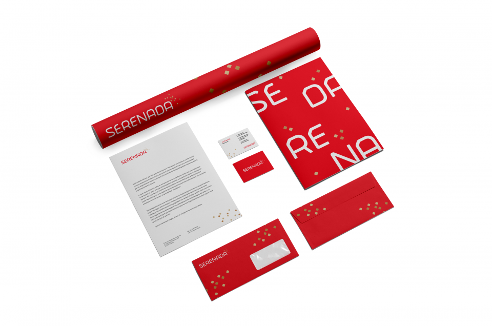
We have won a tender for the new Serenade logo, which is a modern third generation shopping center that offers fashion and enter- tainment. The combination of these two cate- gories in one character was an inspiring chal- lenge.
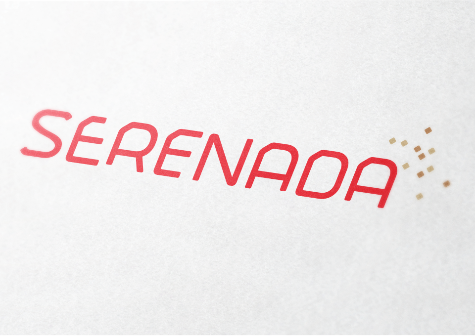
Fashion is freedom, elegance, minimalism expressed in a light and modern font, which refers to the delicate drawing of the outwards. Entertainment is the uniqueness, energy, braw expressed by signet arranged in a sparkling, magical effect.
The basic color of the Serenada brand is bri- ght red, symbolizing energy and passion, whi- le the golden elements of the signet promise the quality of the offer and suggest the extra- ordinary magic of the place.
In addition, based on the created visual iden- tity, we have prepared a system of infogra- phics center markings.
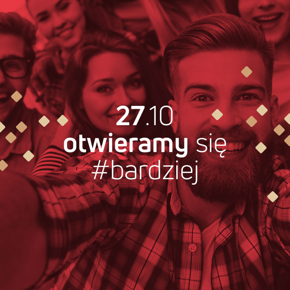
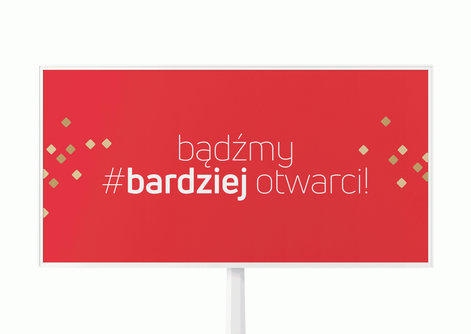
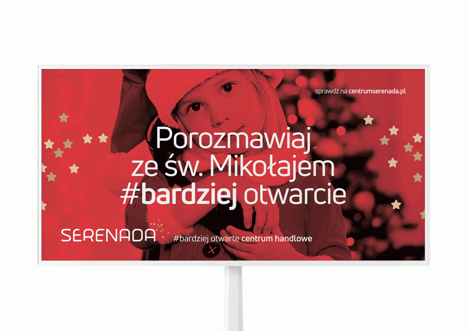
In addition, we were invited to a tender for comprehensive advertising service of the ne- west shopping center in Krakow. We used our experience in the commercial real estate mar- ket, we tried hard, and even #more and we have won. The open campaign began with the teaser with the slogan: “Let’s be #more open.” Then appeared billboards, press ad- vertisements and radio spots inviting to the opening of the shopping center and positio- ning the Serenade as #more open shopping center.
During the first three months, we implemen- ted a campaign introducing Serenade to the market, an image campaign, holiday activities campaign, as well as a variety of projects supporting promotions and everyday functio- ning of the center.
In our day-to-day service, we create adverti- sing materials for all actions that confirm that Serenada cares #more for customers.


